UX DESIGN CASE STUDY
ARtWorx
THE PRODUCT:
We’re ARtWorx. We believe that art is a journey, and sometimes one that is best self-guided.
Browse galleries from around the globe. Experience masterpieces virtually anywhere with augmented reality. Shop merch featuring your favorite pieces, and easily manage museum and gallery trips, all in one place.
PROJECT DURATION:
December 2021 - March 2023
Project Overview
Most tour guide apps deliver designs that are non intuitive, lack key information, and aren’t integrated into the museum’s strategy.
Work closely with galleries to create a tour guide app that allows users to manage trips and favorite works in one place.
Problem
Goal
UX Researcher & Designer creating an app for ARtWorx from conception to delivery.
Conducting Interviews ∙ Paper & Digital Wireframing ∙ Low & High-Fidelity ∙ Prototyping ∙ Conducting Usability Studies ∙ Accounting for Accessibility ∙ Iterating on Designs
My Role
Responsibilities
I created and conducted interviews and put together empathy maps to understand the users I’m designing for and their needs. A primary user group identified through research was working adults who enjoy soaking up culture on the weekends, but can find it to be a bit of a mission, and the apps available to them didn’t help make it any easier.
This user group provided a lot of insight for us in terms of how we can make this app work for not only solo visitors, but also those who may be visiting as family.
Understanding The User
Research also revealed that lack of language options, inability to sync with location, and unrelated third-party advertisements were a few more pain points we hadn’t considered.
“I’m lucky to get a moment to go out by myself these days. Between work and kids, I don’t have time to do all things I would like in terms of really enjoying my gallery experience.
Lane
Age: 36
Education: Vocational
Hometown: Austin, Texas
Family: Partner, 2 Young Children
Occupation: Gaffer
Lane is a single father of two who likes some extra help when planning cultural outings because he typically doesn’t have time to do so otherwise.
Goals
-Wants a more immersive experience from a gallery visit.
Frustrations
-His visual impairment doesn’t allow him to enjoy gallery visits as much as he would like.
Lane is a Gaffer from Austin, currently living in California. Every so often, Lane will check out a gallery exhibition. He enjoys this time, but wishes that art galleries would keep up with technology more. Lane is also a person who has visual impairment, and finds that sometimes the exhibit isn’t easy to see.
Paper Wireframes
Drafting iterations of each screen of the app on paper on paper first allowed me to take a step back and see the bigger picture. It also allowed me to address user pain points out the gate. For the home screen, I wanted to make sure images were at the forefront, and that they, as well as menus, were easy to distinguish and interactive.
Stars were used to mark the elements of each sketch that would be used in the initial digital wireframes.
Digital Wireframes
As I started designing, I made sure to base screen designs on feedback and findings from the user research, once again using images and icons as much s possible, and making sure the menu had a home that was easy to access no matter where you are in the app.
Low-Fidelity Prototype
Using the completed set of digital wireframes, I created a low-fidelity prototype. The primary user flow I connected was building and ordering a pizza, so the prototype could be used in a usability study.
View the ArtWorx low-fidelity prototype
Round 2 Findings
1.Users mentioned they would like to see the wide button option on the ‘Shipping’ page, in favor of the ‘Reverse Interface’ feature.
2. Users would like to see more interactive features such as swipe to go back and forth.
I conducted two rounds of usability studies. Findings from the first study helped guide the designs from wireframes to mockups. The second study used a high-fidelity prototype and revealed what aspects of the mockups needed refining.
Round 1 Findings
1. Users want more options on how they are able to select the date.
2. Users want to see more of the extended button design.
3. Users felt the bottom navigation was getting in the way more than helping.
Usability Study: Findings
Mockups
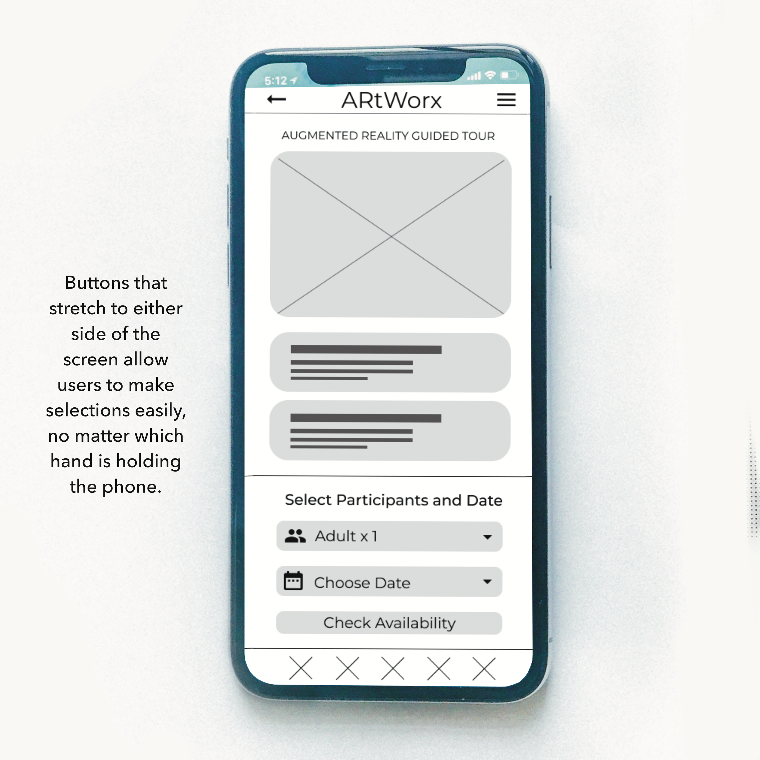
After the usability studies, I noted to make the buttons and links the width of the screen as much as possible, and removed the bottom navigation, finding elsewhere in the app to place them.
Mockups
A participant in the first usability study recommended I add another way for users to select the date on this screen, as its always easier for them to swipe through options.
Attention to detail early on made transitioning design iterations from paper to digital wireframes to low and finally high fidelity prototypes a breeze.
Key Mockups
Below we can see the concept behind the Reverse Interface feature. The first two devices reflect the before and after of reversing.
Usability testing revealed that users preferred the long buttons as shown on device 3.
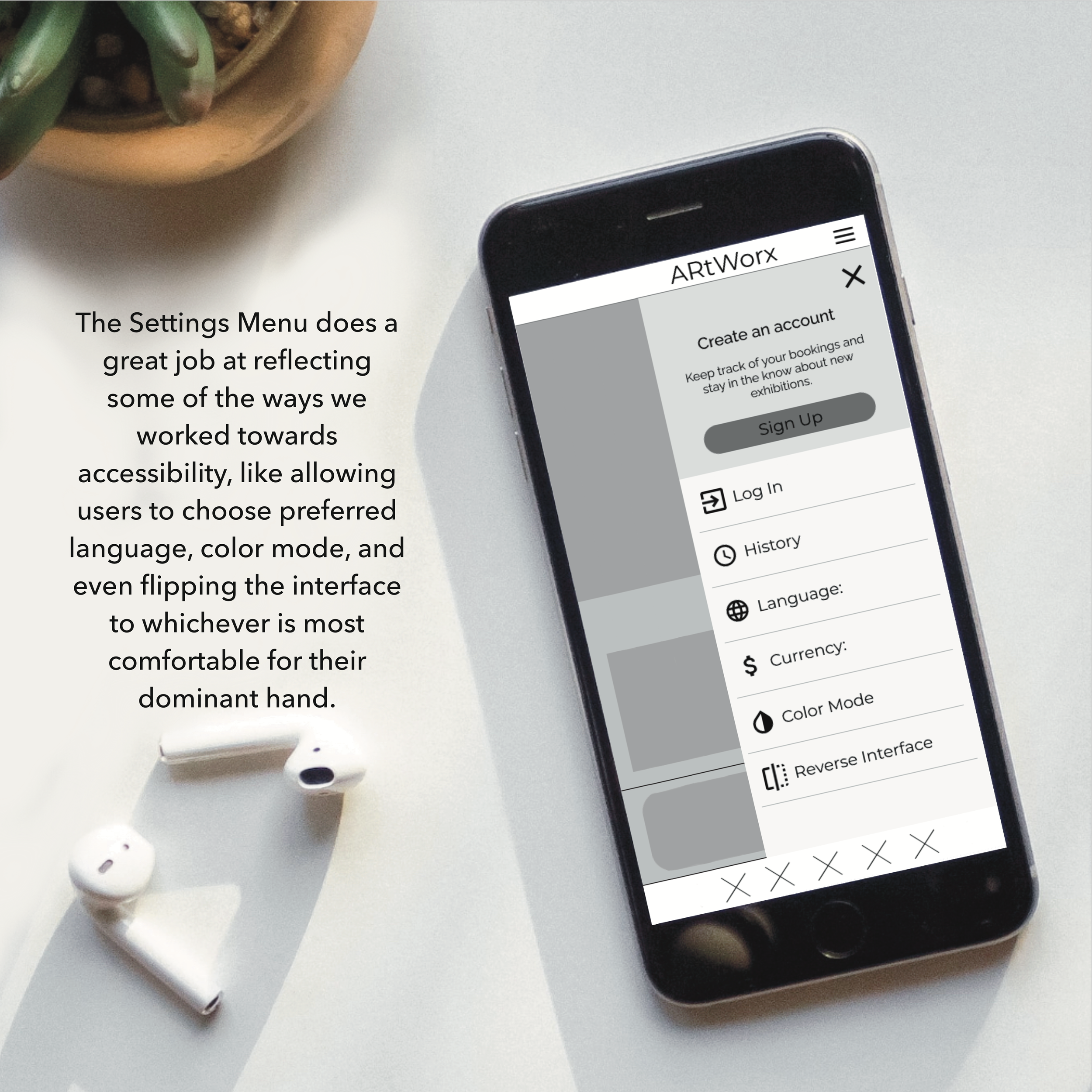
Device 4 shows the settings menu before it was changed to feature buttons as wide as the screen.
High-Fidelity Prototype
The final high-fidelity prototype presented more direct user flows buying a ticket and checkout. It also met user needs for an app that is easy to read and navigate.
View the ArtWorx high-fidelity prototype.

Accessibilty Considerations
Emphasis on imagery and icons help users who my have vision impairments or speak a different language navigate the app.
Users are able to flip UI so that items are shown on the other side of the screen, as well as change the color mode of the app with WCAG 2.0 approved color palettes.
Buttons stretched to width of screen so users can easily reach with either hand.
Impact
The ARtWorx app helps users not only discover new works and experience them in ways like never before, but it also helps users feel seen and heard in terms of in-app Accessibility.
What I Learned
I went in with the goal of designing a product that would shake the industry, but in the end I learned it’s best to make sure user’s needs are met first.
Takeaways


