UX DESIGN CASE STUDY
THE PRODUCT:
Common Space is here to help you see the world in a different way.
Travel and save as a member, enjoying a flexible rental at any of our international locations.
PROJECT DURATION:
May 2023 - June 2023
Project Overview
The problem with available websites for rental memberships is that they are cluttered with ads and sponsored content, which can be misleading and further complicate the process of finding the right apartment. Without access to comprehensive and accurate information, renters may be forced to rely on trial and error, wasting valuable time and money in their search for a place to call home.
My goal was to design a website that is user friendly, ad-free, provides clear navigation, and offers a fast and secure checkout process.
Problem
Goal
UX Researcher & Designer creating a website for Common Space from conception to delivery.
Conducting Interviews ∙ Paper & Digital Wireframing ∙ Low & High-Fidelity Prototyping ∙ Conducting Usability Studies ∙ Accounting for Accessibility ∙ Iterating on Designs
My Role
Responsibilities
I created and conducted interviews and put together empathy maps to understand the users I’m designing for and their needs.
A primary user group identified through research were expats and remote workers who love to travel, but find that traditional hotel and vacation rental sites can lack basic features, and can be more of a hassle than a help.
This user group helped us understand issues we hadn’t considered before - such as lack of language options, and inability to sync with location.
Understanding The User
Research also revealed that users struggled with avoidable challenges such as poor website navigation, lack of filtering tools, limited search options, and a lack of trust in the website or the apartment rental service provider.
"I’m tired of browsing countless websites only to find out that the listings don't fit my needs or are out of my budget. It's frustrating and wastes so much of my time."
Bethany
Age: 27
Education: Bachelor’s Degree
Hometown: Charlotte, NC
Family: Single
Occupation: People Ops Manager
Bethany is a 27-year-old People Ops Manager who works remote and travels often. She is constantly searching for the perfect apartment that suits her lifestyle and budget for her month-long stays - both international and stateside.
She is tech-savvy, and relies heavily on online platforms to search for apartments. She’s used to using various apartment rental websites for the past few months but has not yet found the ideal site that fits her needs.
Goals
To find an apartment that meets her needs and budget.
To save time by using a platform that caters to her specific needs and preferences.
To have multiple housing options to choose from and compare in one place.
To have a seamless and hassle-free rental process.
Frustrations
The overwhelming number of apartment rental websites with listings that do not meet her needs or are outdated.
The need to create multiple accounts on different websites to browse listings.
The lack of personalized recommendations and tailored search options.
The time-consuming rental process and paperwork involved.
User Empathy Map: Bethany, the Tech-Savvy Remote Worker
Says
"I work remotely and travel often, so finding the perfect apartment for my month-long stays is crucial."
"I'm tired of spending hours scrolling through various apartment rental websites without finding what I need."
"I rely heavily on online platforms to search for apartments because it's convenient and saves me time."
Thinks
"I want a platform that offers a wide range of apartment options in different locations."
"I need a website that provides clear and comprehensive information about each apartment."
Feels
Frustrated: Bethany has been searching for the ideal website for months but hasn't found one that meets her needs.
Anxious: She worries about wasting time and potentially ending up in an unsuitable apartment.
Hopeful: Bethany believes that there must be a website out there that can fulfill her requirements.
Does
Visits various apartment rental websites in search of the perfect apartment.
Uses filters and search options to narrow down her options quickly.
Reads reviews and ratings from previous tenants to gain insights about each potential apartment.
Goals
Discover an extensive selection of apartments in different locations.
Access comprehensive details, including pricing, amenities, and previous tenant experiences.
Challenges
Sorting through multiple apartment rental websites for months without finding a satisfactory solution.
Overwhelmed by the amount of information available and the need to cross-reference different platforms.
Difficulty discerning which apartments are truly suited for remote workers compared to regular tenants.
Potential Solution
It would offer an extensive selection of apartments in various locations, ranging from affordable to luxury options.
The website would provide detailed descriptions, and high-quality images of each apartment.
Overall, Bethany is looking for a platform that provides personalized recommendations, a simple and easy-to-use interface, and a seamless rental process.
A website that caters to her housing needs and preferences will help her save time and effort while ensuring that she finds the perfect apartment.
By understanding Bethany's frustrations, aspirations, and behaviors, we can develop a user-centric apartment rental website that does just that.
Paper Wireframes
When designing wireframes for Common Space, it was crucial to consider accessibility from the beginning.
This draft of paper wireframes involves incorporating icons for those who may not speak the default language, and a large search on the forefront, ensuring its easy for users to find.
Stars were used to mark the elements of each sketch that would be used in the initial digital wireframes.
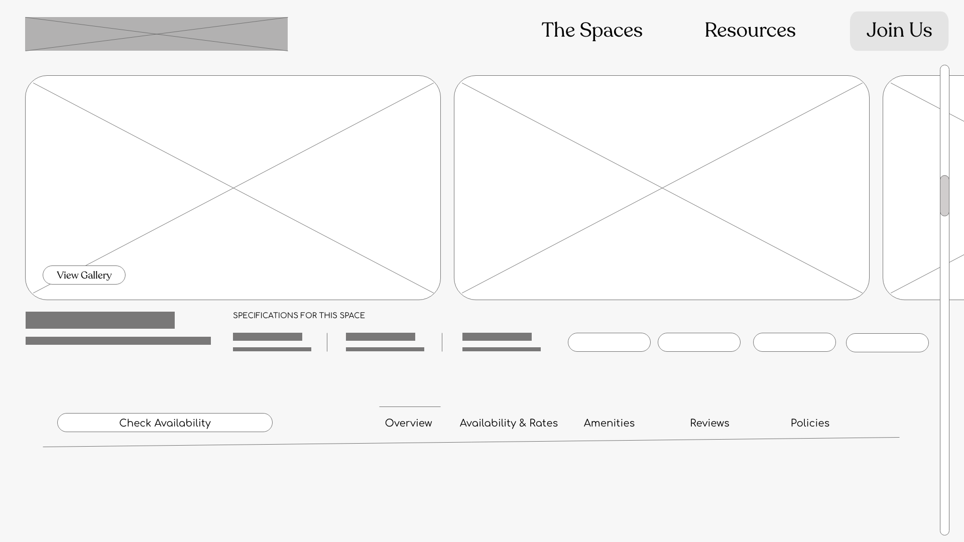
Digital Wireframes
When creating the digital wireframes, I created annotations to demonstrate how interactive items should be announced by assistive technology, such as screen readers.
I also included labels and hierarchy principles, helping map out regions of the interface, and help support efficient navigation for users of screen readers.
Low-Fidelity Prototype
Creating a low fidelity prototype for Common Space was an exciting and seamless process.
Using Adobe XD, I was able to design a user flow that effortlessly guided users through the site's features.
From the homepage, visitors are prompted to view available apartments in their desired locations and easily apply online.
The interface prioritizes simplicity and intuitive navigation, making it easy for users to find relevant information and understand the benefits of becoming a member.
View the Common Space low-fidelity prototype
To make sure I was designing for a broad range of users, I conducted another round of usability studies with a new participant from a different demographic.
"I’m tired of browsing countless websites only to find out that the listings don't fit my needs or are out of my budget. It's frustrating and wastes so much of my time."
Understanding Alex's perspective as a disabled young professional searching for apartment rental memberships is crucial in designing websites that provide comprehensive accessibility information. By incorporating clear and accurate accessibility details, simplifying navigation, and fostering inclusive environments, rental websites can cater to the unique needs and challenges faced by individuals like Alex, providing them with the peace of mind they seek while searching for their next stay.
Alex
Age: 34
Education: GED
Hometown: Tokepa, KS
Family: Single
Occupation: People Ops Manager
Alex is a highly motivated and ambitious young professional who has a physical disability that requires mobility aids.
He lives independently and has a job as a People Ops Manager.
Alex is an avid user of apartment rental websites and is in search of an apartment rental membership that accommodates his specific needs.
Goals
Alex's primary goal is to find a reliable apartment rental membership that caters to his disability-related needs. He wants to have the accessibility features required for his wheelchair and desires a safe and inclusive environment.
Frustrations
Alex spends a significant amount of time researching different websites and reading reviews to ensure they provide accurate accessibility details. He contacts rental agencies to inquire about specific features, but often feels discouraged by the lack of knowledge about accessibility requirements.
Empathy Map:
Says: "I wish these rental websites would clearly outline their accessibility features so that I can make informed decisions."
Thinks: "I hope I can find a place where I can move freely without any barriers. It would be great if there are automatic doors, spacious elevators, and accessible bathrooms."
Does: Alex spends a significant amount of time researching different websites and reading reviews to ensure they provide accurate accessibility details. He contacts rental agencies to inquire about specific features, but often feels discouraged by the lack of knowledge about accessibility requirements.
Feels: Alex feels frustrated when he encounters websites with inaccessible interfaces or poorly labeled images. He is concerned about whether the places he finds will truly meet his needs and worries about the challenges he may face in the rental process.
Round 2 Findings
Participants encountered difficulties while using the search functionality to find suitable apartments.
They expressed frustration over the limited filtering options and the inability to sort results based on specific criteria, such as price range, location, or amenities.
Participants desired more advanced search options that would allow them to customize their preferences and facilitate a faster and more accurate search process.
As one participant noted, "I wanted to see how the apartments looked like inside. Without any images or interactive elements, it's hard to decide if it's worth considering."
I conducted two rounds of usability studies. Findings from the first study helped guide the designs from wireframes to lo-fi protoypes.
The second study used a low-fidelity prototype and revealed what aspects of the protoype needed refining before going hi-fi.
Round 1 Findings
Users expressed dissatisfaction with the limited interactive elements in the wireframe design. They expected more interactive features, such as virtual tours or integrated maps, to help them understand the apartments' layout and location. The static nature of the wireframe made it difficult for users to visualize the offerings, leading to doubts and hesitations.
Usability Study: Findings
Mockups
After the usability studies, I made sure to add more interactivity in the prototypes, such as viewing the space in Augmented Reality, as well as more clear and robust search options.
Alex’s study made me go back to the drawing board in a big way, really expanding search options to make sure its easier for people with disabilities to find their next stay.
Mockups
I decided to change my original header to one that was more inclusive, giving users the option to quickly update currency and language preferences, as shown below.
Mockups
The new details page conveys a button for AR features, and when you click “More Details” you are taken to a page that includes special information and accessibility features of the space, as shown below.
High-Fidelity Prototype
I developed a high-fidelity prototype to ensure the usability of the final product. In order to cater to the diverse needs of our users, I incorporated more search options into the prototype.
By expanding the search options, such as filtering by location, rental prices, amenities, and lease terms, I aim to provide a personalized and efficient apartment hunting experience. The final high-fidelity prototype also presented more direct user flow in checkout.
View the Common Space high-fidelity prototype.
Accessibilty Considerations
I created annotations and labels to demonstrate how interactive items should be announced by assistive technology, such as screen readers.
I employed clear structure and navigation so that users who rely on screen readers are able to navigate the site.
Re-designed the site to be more inclusive, giving users the option to quickly update currency and language preferences.
Impact
Designing this site for Common Space was a challenging, yet fun journey filled with valuable takeaways.
As I finally wrap up this project, a sense of accomplishment and satisfaction washes over me. The culmination of hard work, creativity, and attention to detail brings an overwhelming feeling of fulfillment.
Conducting usability studies to gauge the effectiveness of my designs have further solidified my satisfaction with the results so far. Seeing users navigate effortlessly through the website, searching for apartments seamlessly, and engaging positively with its features has reinforced the importance of user-centric design.
The experience has reinstilled the significance of thorough research, intuitive navigation, and clear communication in creating a functional and visually appealing website. Overall, this project has reminded me of the power of design in enhancing digital experiences and the joy of creating user satisfaction through intentional, inclusive, and accessible design.
What I Learned
After this project, I’ve learned a great deal about creating compelling user experiences.
One feature that I found invaluable during this process was just how powerful Adobe XD's prototyping capabilities are. It allowed me to bring my design to life through interactive and clickable prototypes, enabling me to showcase the flow and functionality of the website effectively.
Additionally, I gained a deeper understanding of the importance of designing with accessibility in mind. I discovered that by incorporating accessible design principles, such as providing alternative text for images and ensuring proper color contrast, I could make the website more inclusive and user-friendly for individuals with disabilities. This experience has enriched my design skills and reinforced the significance of considering accessibility as an integral part of the design process.
Takeaways
